UI and general improvements - Devlog #7
Depth Above (Demo) » Devlog
UI
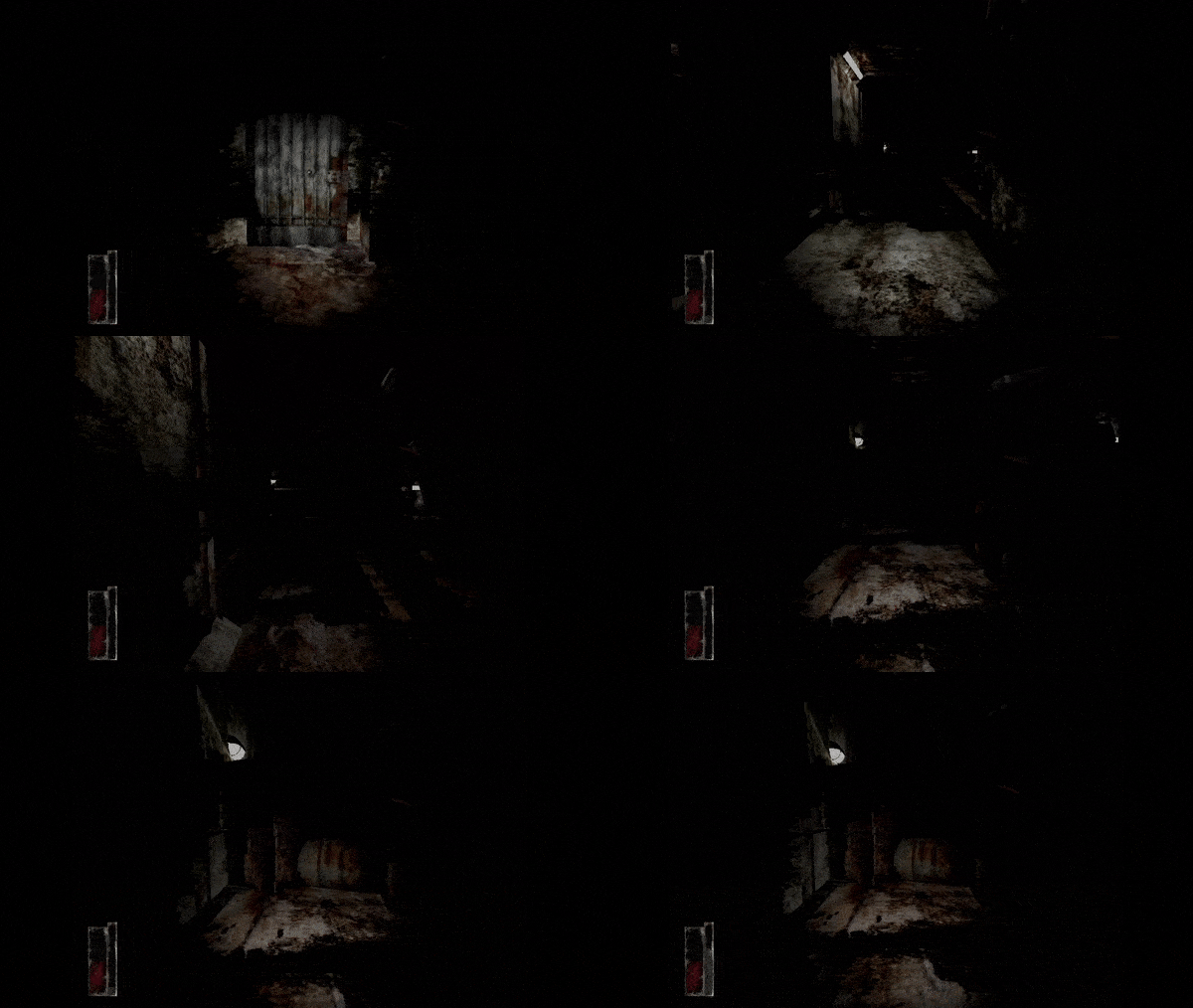
- Added health and stamina HUD indicator
- Health in HUD matches actual player health
- Designed stamina system with tired state
- Designed notes menu
- Text from notes can now be read through a Silent Hill-esque interaction
INVENTORY
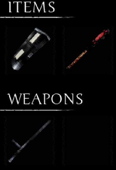
- Made renders for all the inventory items
- Renders show up in the inventory as item icons
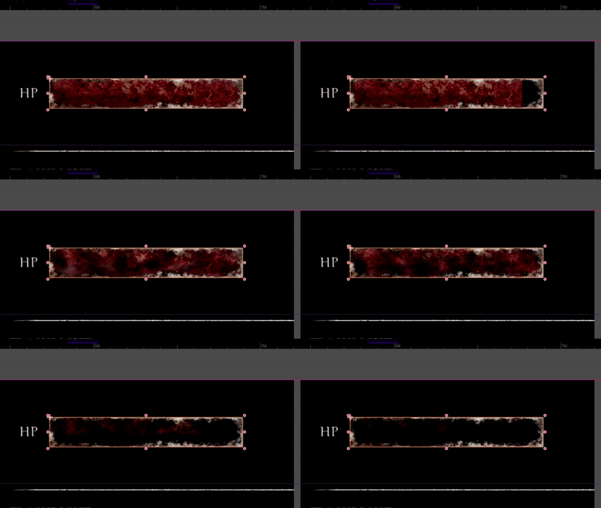
- Made shader for low health inside the inventory (bar flickers when health is below 20 to add more tension)
- Designed new system for items
- Instead of using buttons, a set of items inside of another one (ItemList node) will be used instead. This node allows me to add new items in a much easier way, as well as detecting the currently selected item
- Animated selection box for currently selected items, weapons and supplies
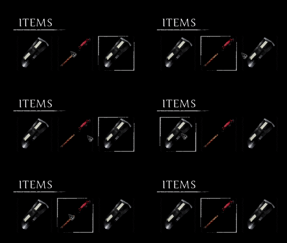
- Designed equip / unequip system, which also modifies the viewmodel visibility according to the equipped item
OTHER
- Edited and added stone footsteps as well as the whole footstep sound system.
- Finished save room interaction with note system
- Fixed major raycast bug
- Fixed flashlight and nightstick viewmodel clipping through walls
Get Depth Above (Demo)
Download NowName your own price
Depth Above (Demo)
2000s-style horror game heavily influenced by Silent Hill/Cry of Fear/Lost in Vivo
| Status | Released |
| Author | Darxkl05 |
| Genre | Action |
| Tags | 3D, Atmospheric, First-Person, Horror, Indie, Psychological Horror, Retro, Survival Horror |
More posts
- Devlog #17 - BCN Game Fest, Underwater movement, scene 6 map updates29 days ago
- BCN GAME FEST DEPTH ABOVE STAND INFO51 days ago
- DEPTH ABOVE AT BCN GAME FEST 202559 days ago
- Devlog #16- UI and HUD improvements, monster fully implemented95 days ago
- Devlog #15 - New weapon, gameplay improvements, underwater effectsJul 20, 2025
- Devlog #14 - New monster, planning future sectionsMay 21, 2025
- Linux Build FixMay 15, 2025
- Devlog #13 - New and Improved gameplay mechanics, Scene 5 finishedApr 13, 2025
- Devlog #12 - Scene Puzzles, shaders and particle improvementsMar 11, 2025
- Devlog #11 - Water Shaders and Visual FixesFeb 09, 2025
Leave a comment
Log in with itch.io to leave a comment.